My first issue of Blueprint finally arrived in the mail on Saturday. I had already plunked down the $18 subscription—perhaps hasty given I had yet to see the first issue, but such was my confidence in the great and mighty empire Martha built.
I'd read some reviews that made me wary. Design*Sponge thought it was trying to be too much—home/health/beauty/fashion/the kitchen sink. Indeed the subtitle of the magazine is "Design Your Life"—hardly a humble goal and one which may prove to be a vaulting ambition just waiting to o'erleap itself. But, I didn't really consider the breadth of the subject matter to be a negative. They can toss in the kitchen sink if they want because they would probably give us such a thoughtful, creative, and beautifully executed article that we would never look the same way at our kitchen sinks again.

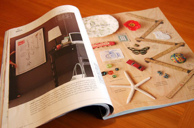
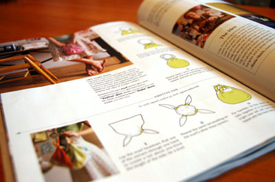
All the good bits of the traditional Martha Stewart are there: how-to's, nifty ideas, gourgeous photography, and breathtaking layouts. It is certainly geared toward a younger audience, and it's also a little more urban, modern, and minimal. They strike a very graceful balance—it brought to mind the easy marriage of playfulness and sophistication that is the hallmark of Kate Spade.

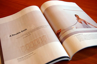
If the cover resembles a little too closely a J. Crew catalog, they can be forgiven because the interior layouts are fresh and interesting. My only criticism was the issue seemed a little overworked—every word, every element of every photograph is so carefully treated as to seem to be trying a bit too hard. Will be interesting to read subsequent issues as I am sure the daily grind of churning out the magazine will cure this all too quickly.
In all, I'm very glad I plunked down my $18. Any magazine that includes a tear-out sheet of graph paper (and lovely thick, soft graph paper at that), has got it about right.

1 comment:
Very pretty design! Keep up the good work. Thanks.
»
Post a Comment