

Color combo #1 (above) has four options (below). Twin likes the contrast and the cheerfulness of it but the word "garish" did pop up.

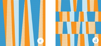
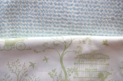
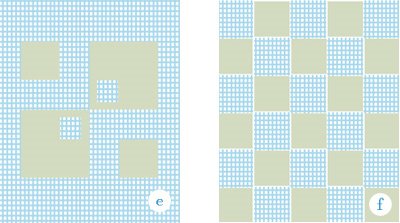
So color combo #2 is the opposite end of the spectrum. Very subtle, very quiet. I really love this pale green print—it has the sweetest illustrations all over it. So I was thinking large, uninterrupted areas of the prints. 2 options.
I haven't really sat down to figure out how I would actually go about piecing these, and I haven't even given a thought yet to the quilting. However, time is of the essence, as the shower is fast approaching.
The mom is a hip, very NYC kind of gal.
Anybody have any opinion, advice, thoughts about any of this?
Julie, all the choices are beautiful! I really love the check and the green print. That said, I think color combo one is great, too and I like version a and version d. I know they are very different, but those are the ones speaking to me. Whatever you choose, I am sure that it will beautiful.
ReplyDeleteWow. I think the indecision problem comes in because you have really great taste and each choice is a stunner. I could be here all day trying to choose a favorite, but I'll just go off the top of my head and say D. Different, fun, spunky.
ReplyDeleteI like d the best too! Orange is a very hip choice.
ReplyDeleteI like d the best too! Orange is a very hip choice.
ReplyDeleteThat's a difficult choice -- nice color and print pairings! Although I love the green and blue, I'd say the orange is less typical of what people generally give to babies. After my shower, I was pretty tired of pastels -- I'm a brights gal. So I'd say orange. I like A and D, maybe A a little more.
ReplyDeleteI love the first colour combination! I really like option D too :D
ReplyDeleteA! A! A! how did you do this? i try to do this in my brain and it never works.
ReplyDelete"c" is so gees bend -- I love it.
ReplyDelete(and could you turn your phone back on? -- inquiring marmees like to talk to daughters, but it's hard when both cell phones are turned off.
D gets my vote. Little TBD will look great wrapped up in it. :)
ReplyDeleteThe orange and blue color combo is awesome. I'm partial to C, but I could easily be persuaded to swing over to D, since it seems to be a favorite of so many other readers. What a lucky, lucky friend you have!
ReplyDeleteDefinitely the blue and orange, but then I love color. I really do love all of your designs, but if time is of the essence I'd go with A, though I think D is my favorite.
ReplyDeleteI'm not a pastels kind of girl so A gets my vote...also I don't think the pattern would hurt the eyes (make you go cross eyed...)
ReplyDeleteI'd also go for the first group of colors (though I do love the pale green print), and C is my favorite. It's simple but not too simple.
ReplyDeleteI'm going to go out on a limb here and say... wait for it... f. There, I've said it.
ReplyDeleteWhatever you decide, however, will turn out wonderfully well.
I am a very big fan of option A with the first color scheme. However, I'd cry if you gave me any of these. Especially if I was pregos!
ReplyDeleteEek! I love both fabric combinations. But I'm partial to orange + blue and design A/C/E. I can't wait to see the finished quilt. Your friend is going to LOVE it.
ReplyDeletehmmmmmmm... i just can't decide btwn c and e... either way- it is sure to be a hit! remind me next time i see you, i think i have a fun idea for u...
ReplyDeletegood day
mrs. penot
I love design (e). The green is really soothing and looks like a toile, which a hip mom would like (?)(well, i would anyway), and there are big enough pieces of the green so you'd see more of the fabric pattern.
ReplyDeleteMaybe you could use another great print for the back, completely opposite almost, from the front fabrics... making it reversible.